Sides of a Coin
Beloved artist Owen Mortensen finds minimalist beauty in the mundane
In 1904, freshly-reelected President Theodore Roosevelt wrote Treasury Secretary Leslie Mortier Shaw expressing his disdain for the design of American coins: “I think our coinage is artistically of atrocious hideousness… Would it be possible, without asking the permission of the Congress, to employ a man like [Augustus] Saint-Gaudens to give us a coinage that would have some beauty?” An artistic intervention ensued, resulting in eagle designs for the gold $10 and $20 coins, and continued after Roosevelt’s presidency with the administration of William Howard Taft commissioning sculptor James Earle Fraser to spruce up the nickel. Having been an assistant on Saint-Gaudens’ redesigns, Fraser presented multiple concepts including the chosen design with a silhouetted bison on one side and the portrait of an American Indian man on the other. Fraser said the figure was a composite of several leaders—Iron Tail (Sioux), Big Tree (Kiowa) and Two Moons (Cheyenne)—although others, including Two Guns White Calf (Blackfoot) and John Big Tree (Seneca) also claimed to have been his models.
Even the visual origins of the bison are contested: Fraser claims to have turned to the Bronx Zoo in New York for inspiration, spending hours in the company of the American bison Black Diamond, a creature he considered “the contrariest animal in the Bronx Zoo. I stood for hours... He refused point blank to permit me to get side views of him, and stubbornly showed his front face most of the time.” And yet, Black Diamond never lived at the Bronx Zoo, instead claiming the Central Park Zoo as home. Historians have since fact checked Fraser, and cited Bronx, the aptly-named resident bison of the Bronx Zoo, as the model. What’s more, the naming of the nickel further complicates its narrative: composed of 75% copper and 25% nickel, a prominent numismatist of the day recommended that it be accurately be called the “Bison copper.”
By way of all these historical twists and turns, we arrive at the Buffalo nickel as new source material for artist Owen Mortensen. True to the plot lines unpinning the nickel itself, Mortensen honors the stories within every object he transforms into art. And he recognizes the same instinct in the interior approach of Twenty Two Home: it’s the stories behind the products that make them shine within the personal history of a home.
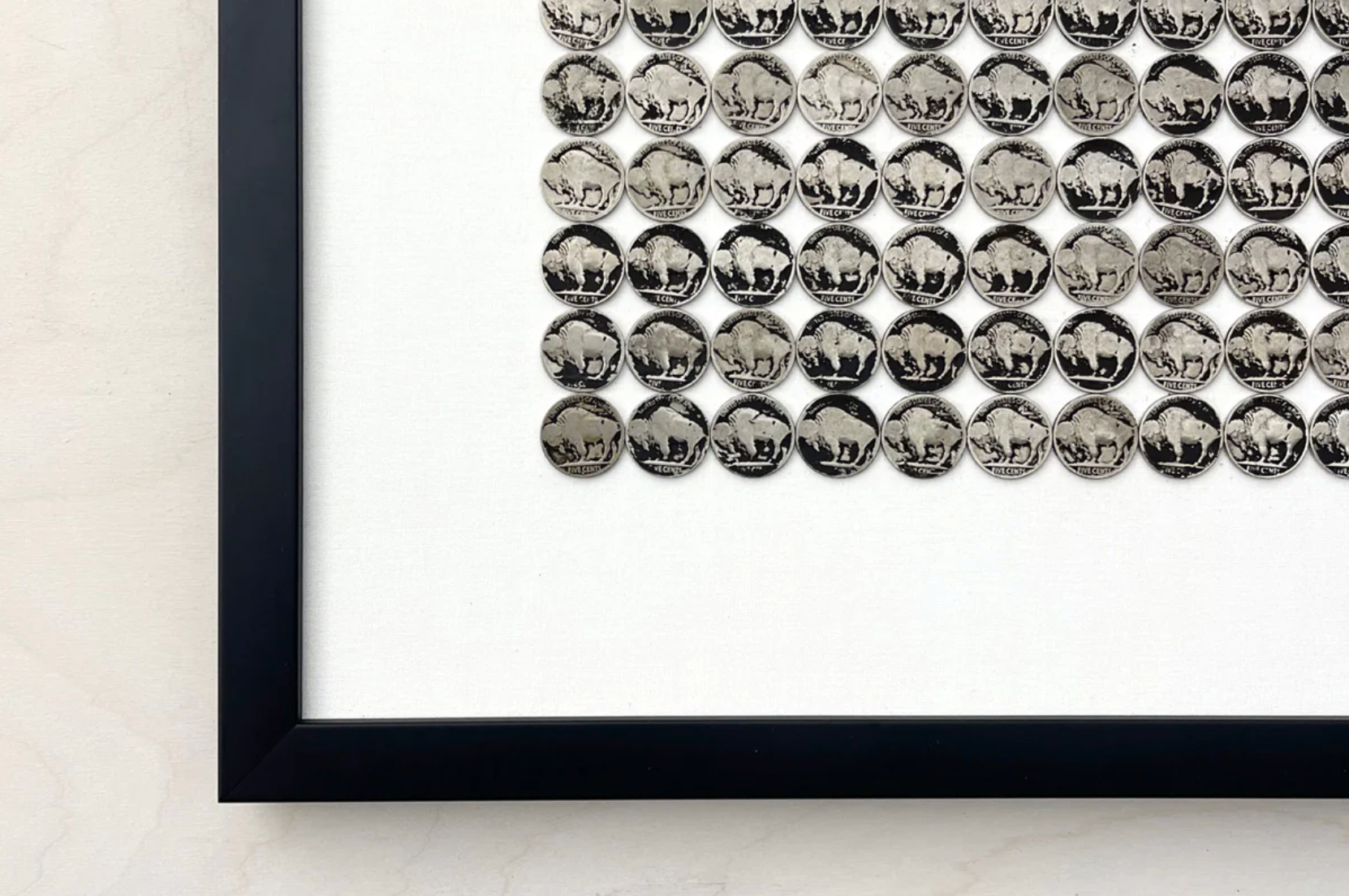
Driven by the desire to feature the beauty within the mundane, Mortensen presents Buffalo nickels as layered icons of the American West, as historically textured as the frontier itself (and indeed the coin’s own story). “Buffalo nickels are unique to the history of Western expansion,” he says, referencing their inclusion in Andy Warhol’s series on Western icons. “Contemporary artists have seen something in them to be explored,” Mortensen says. “I’ve always enjoyed skipping interpretation to deal with the thing itself whether a natural or found object.”
Citing the violence done to both subjects of the coin, Mortensen hopes to honor that complicated history by burnishing each piece in burnt hues of deep ochre and charcoal black. Arranging the nickels in orderly rows, he constructs compositions of profound graphic impact by presenting the currency en masse. Having studied architecture, Mortensen asserts his sense of refined form and raw materiality in these nickel tableaus.
“I work in this space of Western and modern,” he says. “I’m trying to provide work that speaks to people here. I’m always looking for and finding inspiration in the everyday artifacts around me.”
Beloved by Twenty Two Home customers and Snake River Interiors clients for his tumbleweed chandeliers, Mortensen considers his new Buffalo nickel series within the wider arc of his oeuvre. “My whole artistic career has been centered on repurposing the mundane,” Mortensen says. His aesthetic, which he labels organic minimalism, fits beautifully within Twenty Two Home, a context he appreciates greatly. “The showroom is eclectic and so much about creating a story for the whole room,” he says. “My work contributes to that. It adds texture and dialogue. Elisa does such a great job of mixing artwork and furnishings to convey the story each client wants to tell.”
The moment Elisa met Mortensen at a summer art fair in Jackson, she recognized a kindred spirit in eloquent design. “He is an incredibly inventive character,” she says. “He’s brimming with ideas. We’ve designed so many different collections together.” Mortensen values their shared love of the West. “We both embrace the West and its wildness, its openness. We’ve grown in tandem with each other. She stands behind my work.
“My hope is to make fine art that is attainable for the home.”


